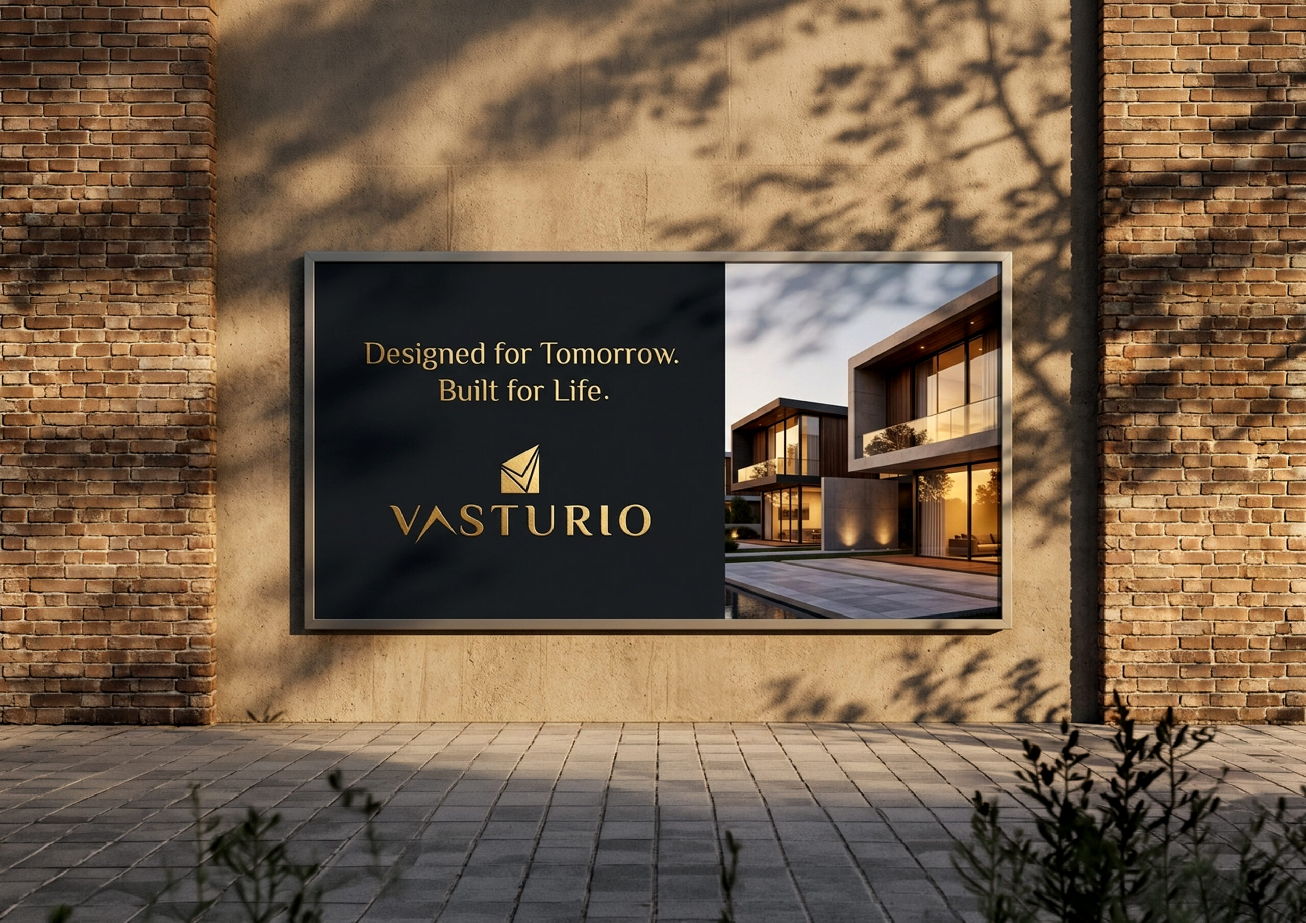
Luxury Real Estate Branding
Crafting spaces that reflect trust, structure, and timeless living.
Overview
Industry: Real Estate
Services: Brand Identity, Art Direction
Type: Concept / Case Study
The Challenge
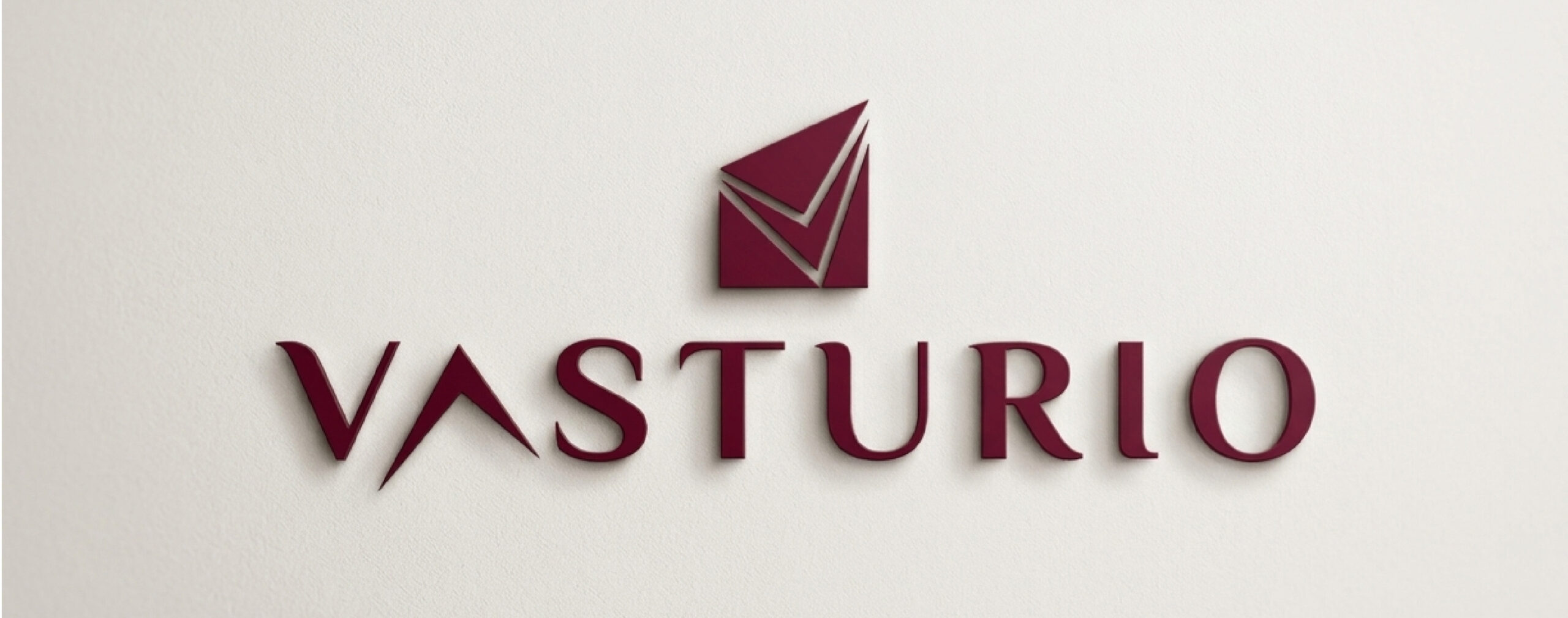
The goal was to create a luxury real estate brand that feels modern and global, while avoiding overused visual clichés often associated with premium property branding.Design a luxury real estate identity that feels contemporary and globally relevant while avoiding traditional, overused premium aesthetics. The goal was to create a brand that communicates exclusivity through simplicity rather than ornamentation.
Concept Direction
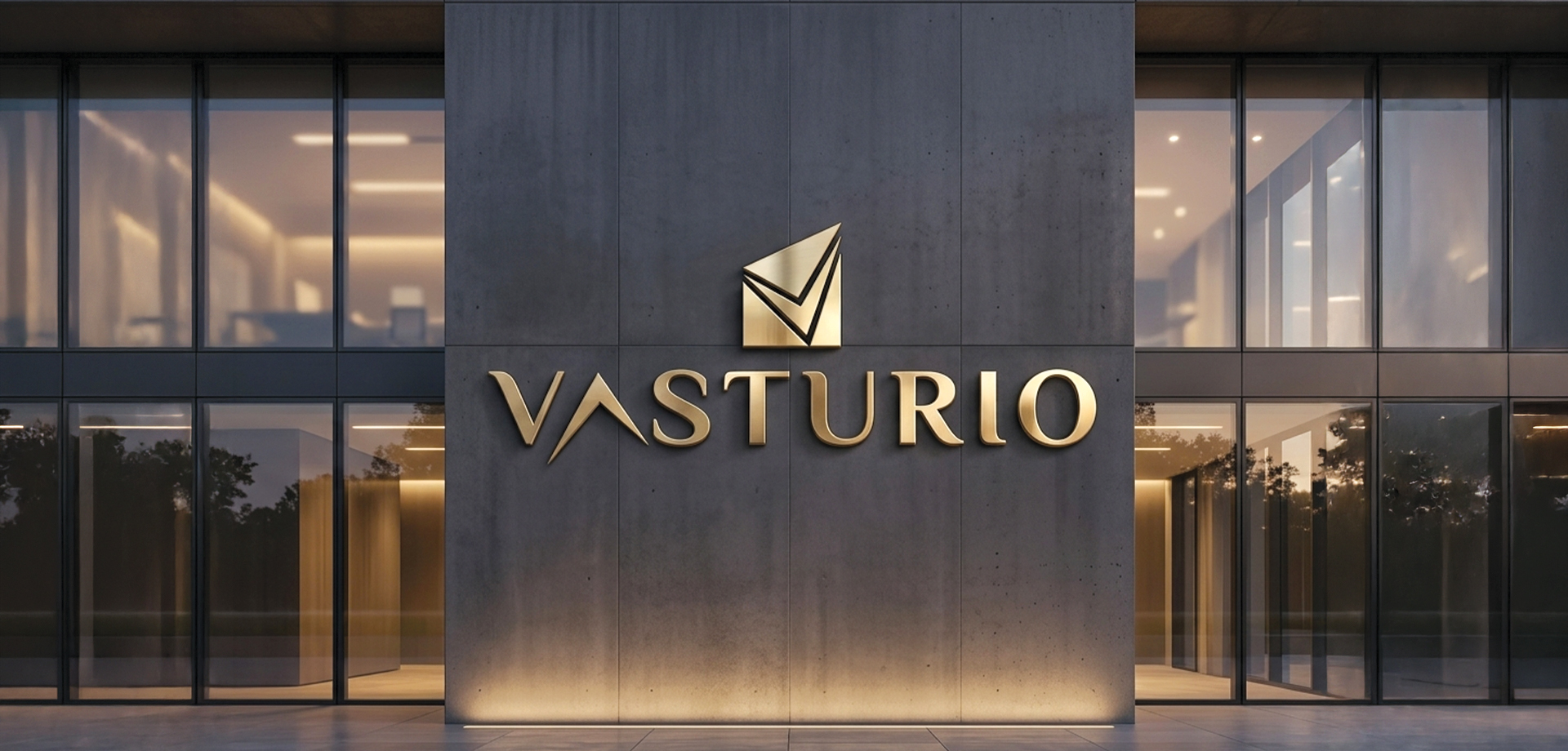
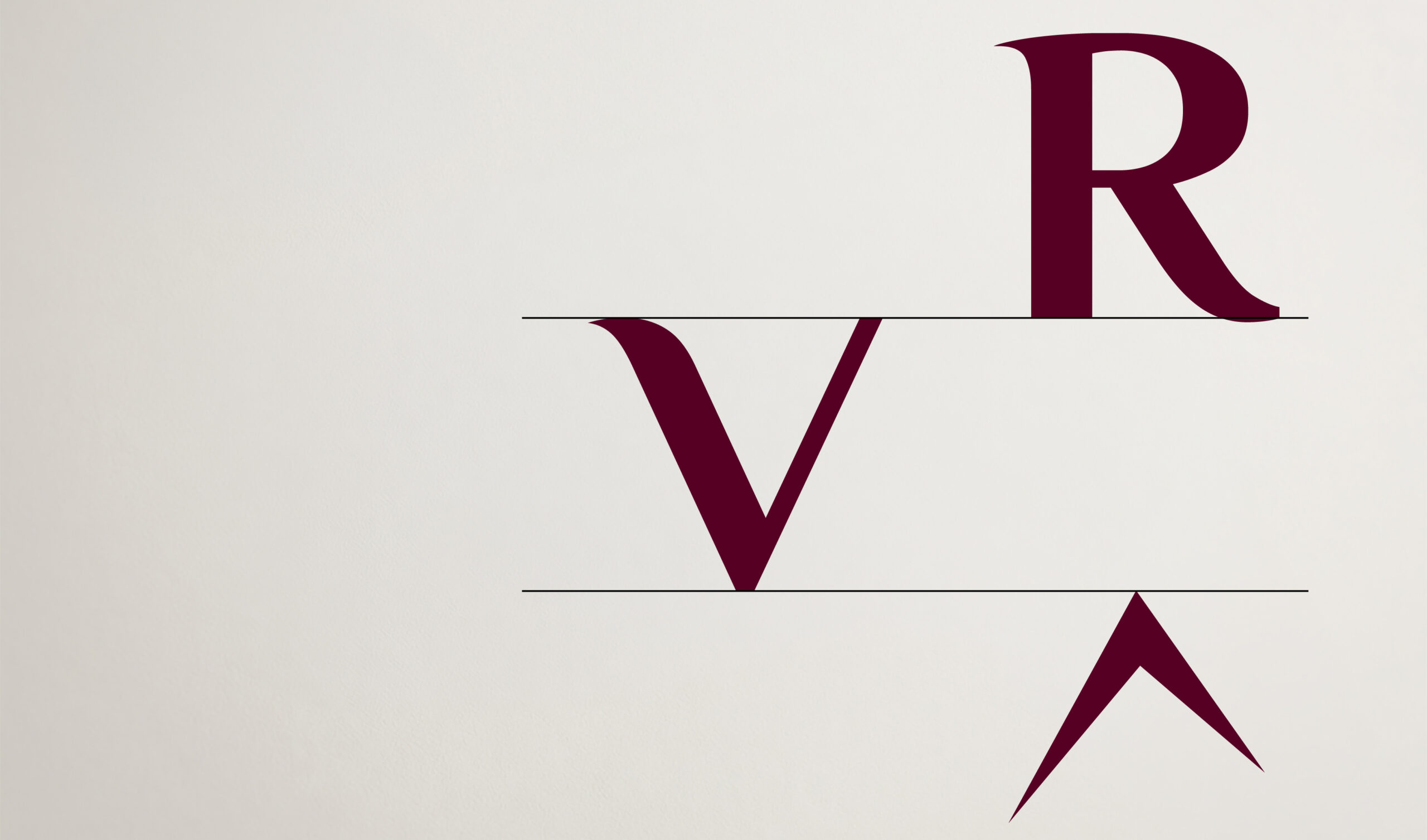
The concept focuses on restraint and precision. Inspired by architectural balance, the identity uses negative space and refined typography to communicate quiet luxury.The identity is built on precision, restraint, and structure. Inspired by architectural forms and spatial balance, the design emphasizes clarity and confidence. Every element is intentional, allowing the brand to feel composed, timeless, and quietly distinctive.
Brand Foundation
Positioning: Premium real estate for a modern, design-conscious audience
Audience: High-value investors and lifestyle-driven buyers
Tone: Minimal, refined, confident
Visual Identity
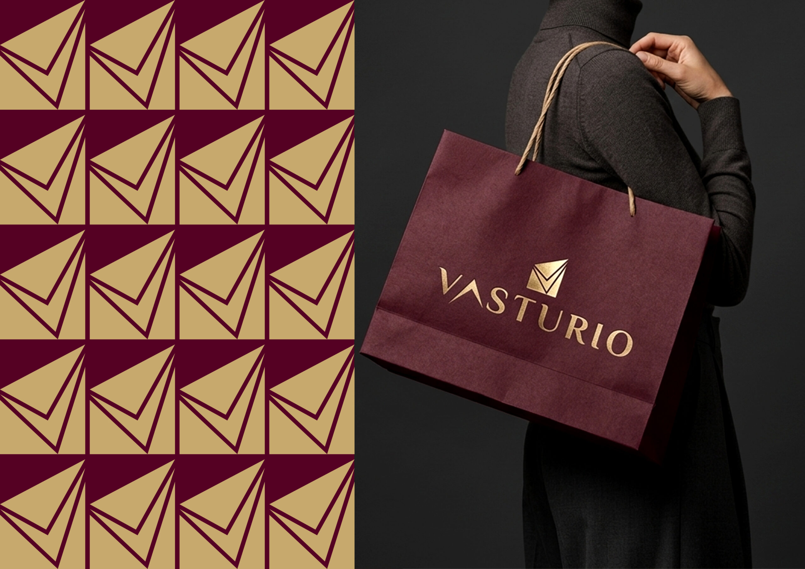
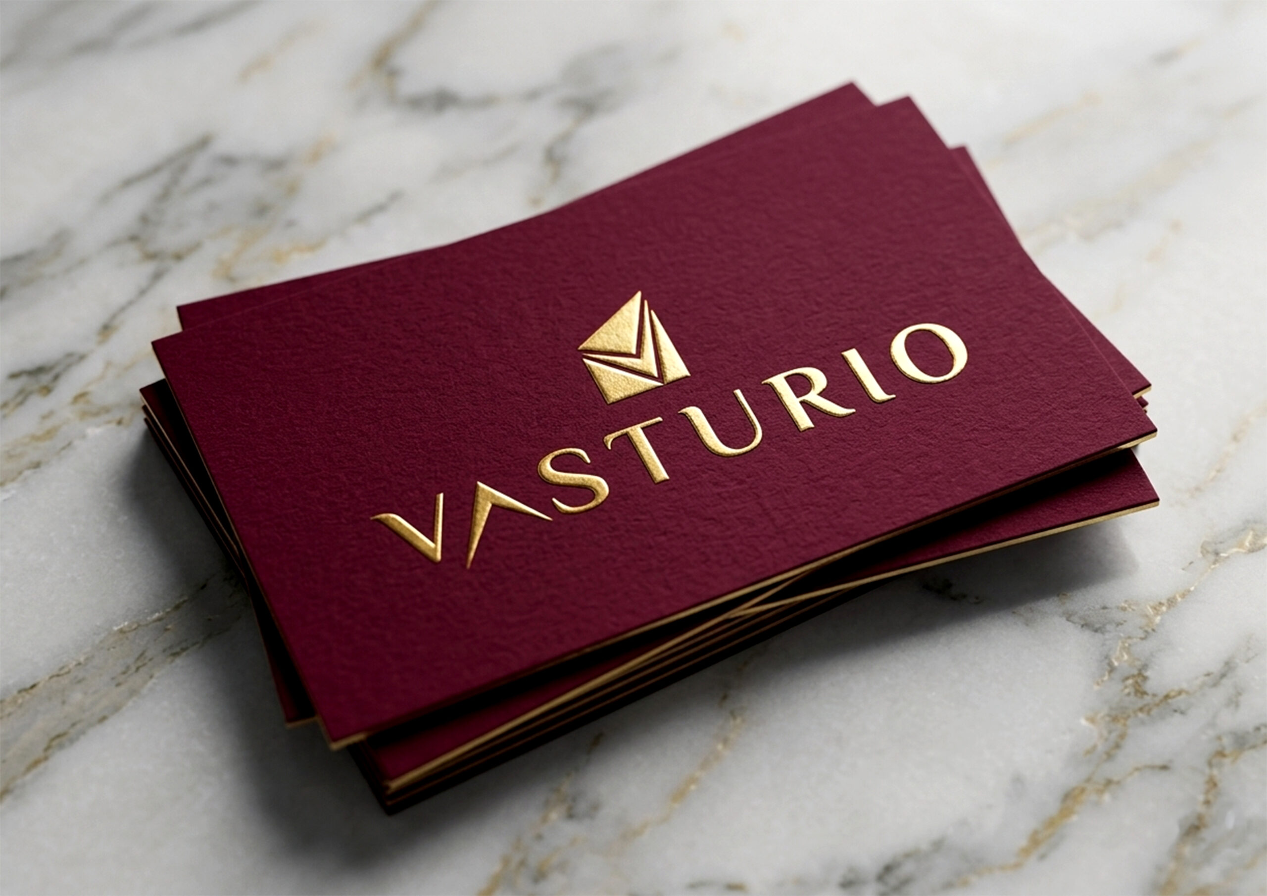
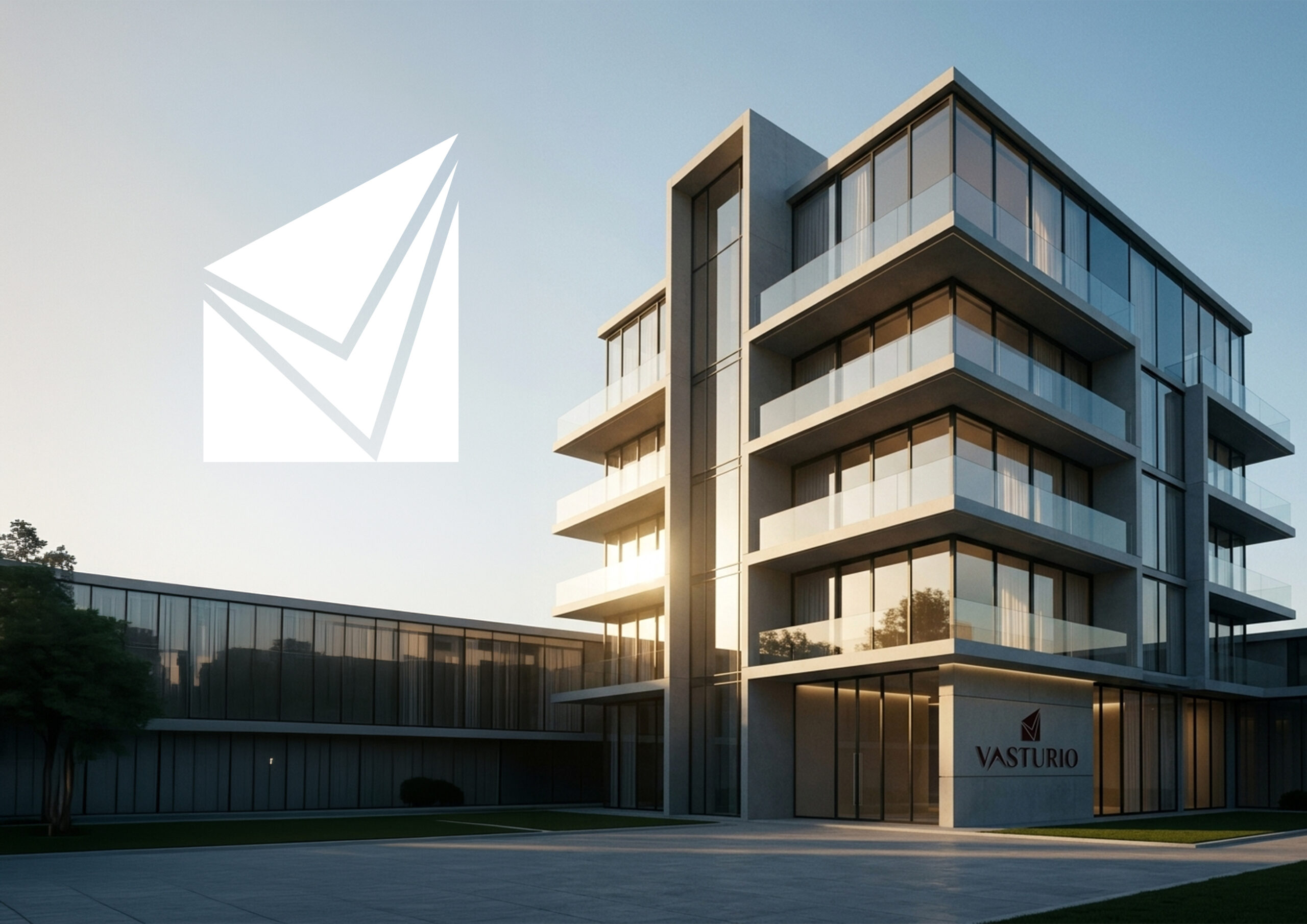
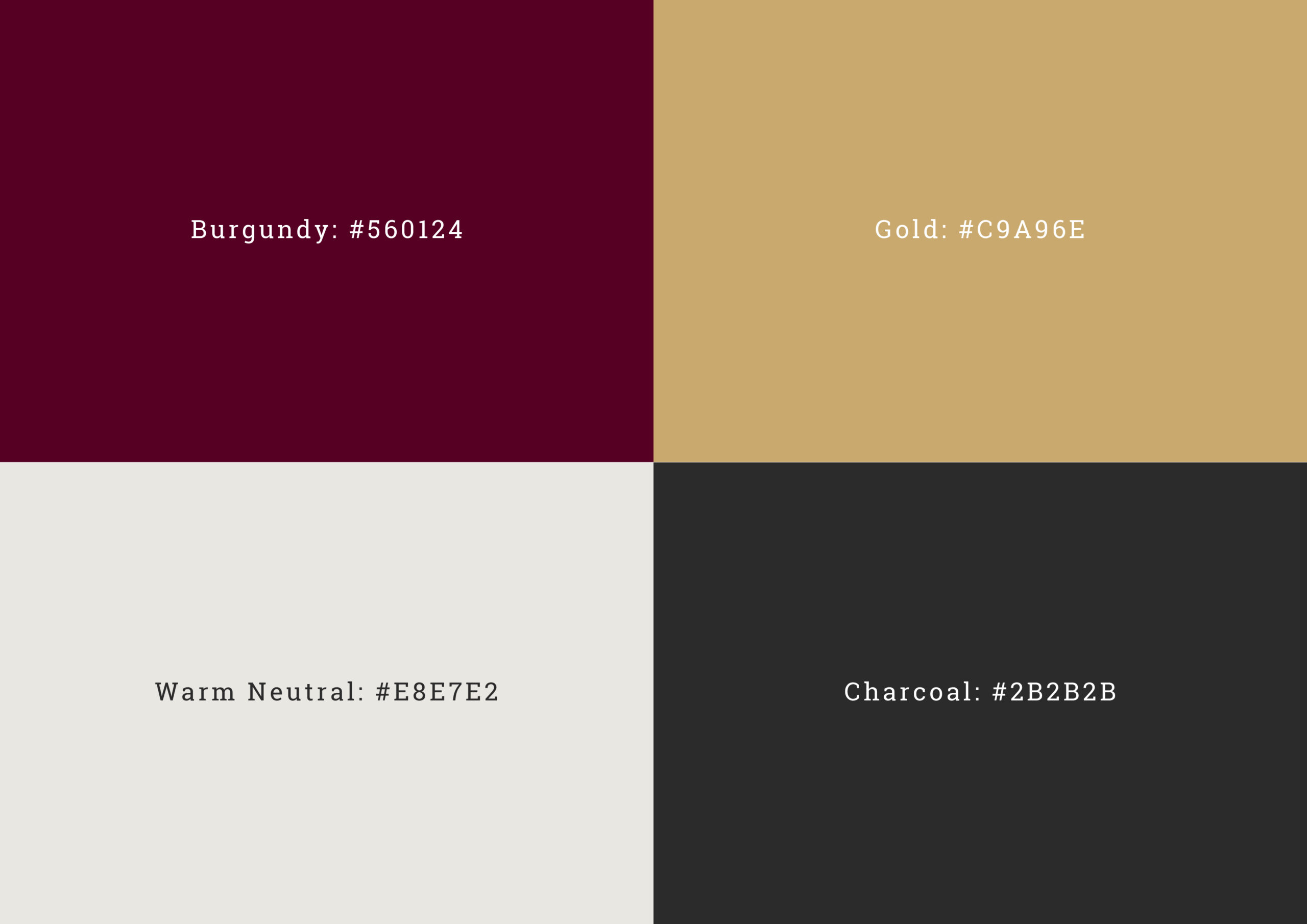
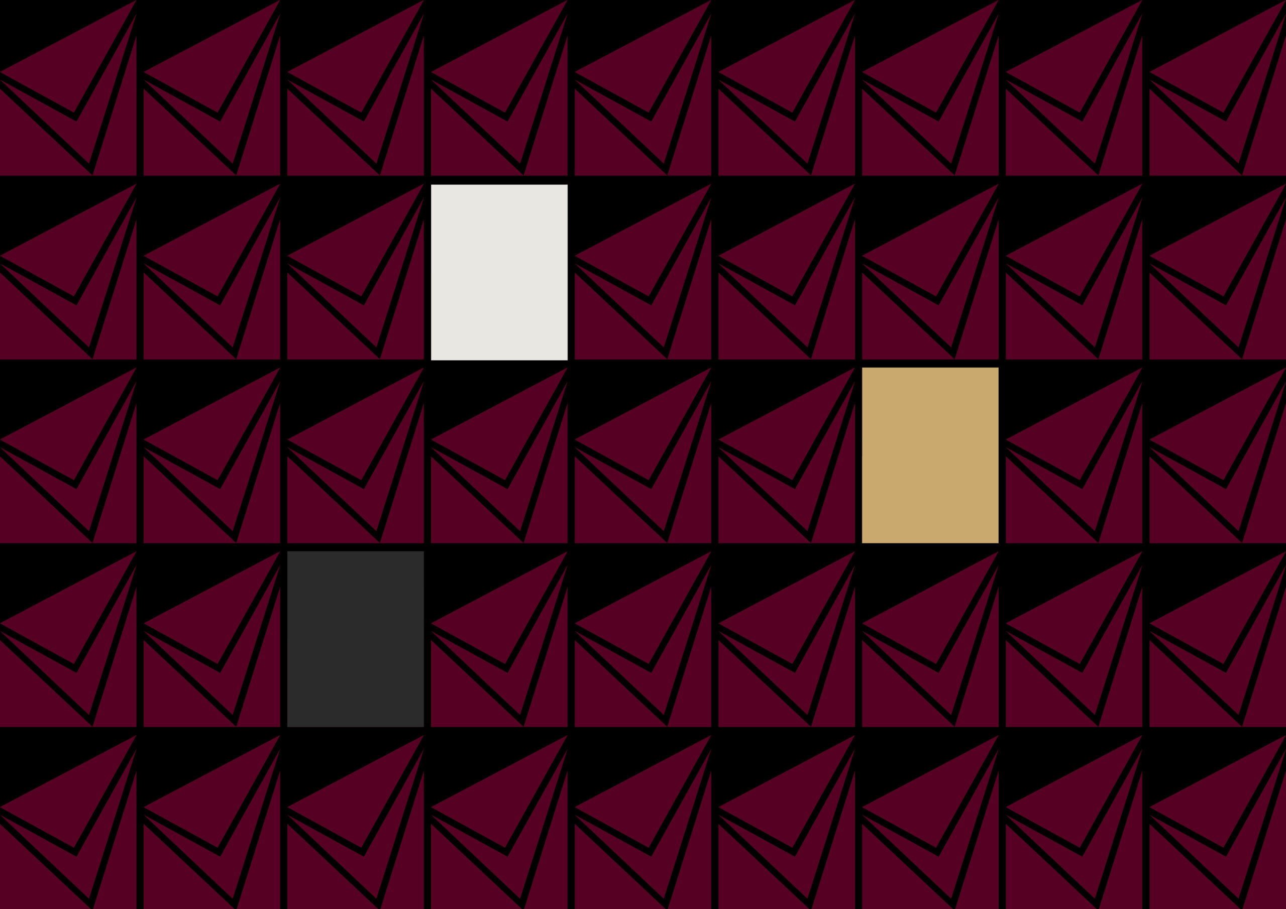
The visual system is rooted in a balance between sharp geometry and elegant typography. The mark reflects upward movement and structural form, subtly referencing growth, elevation, and built environments.Typography is selected to convey sophistication without excess, maintaining clarity across all touchpoints.The color palette is defined by a deep burgundy and muted gold, supported by warm neutrals and charcoal tones. This combination creates a sense of depth, warmth, and understated luxury.

Brand in Use
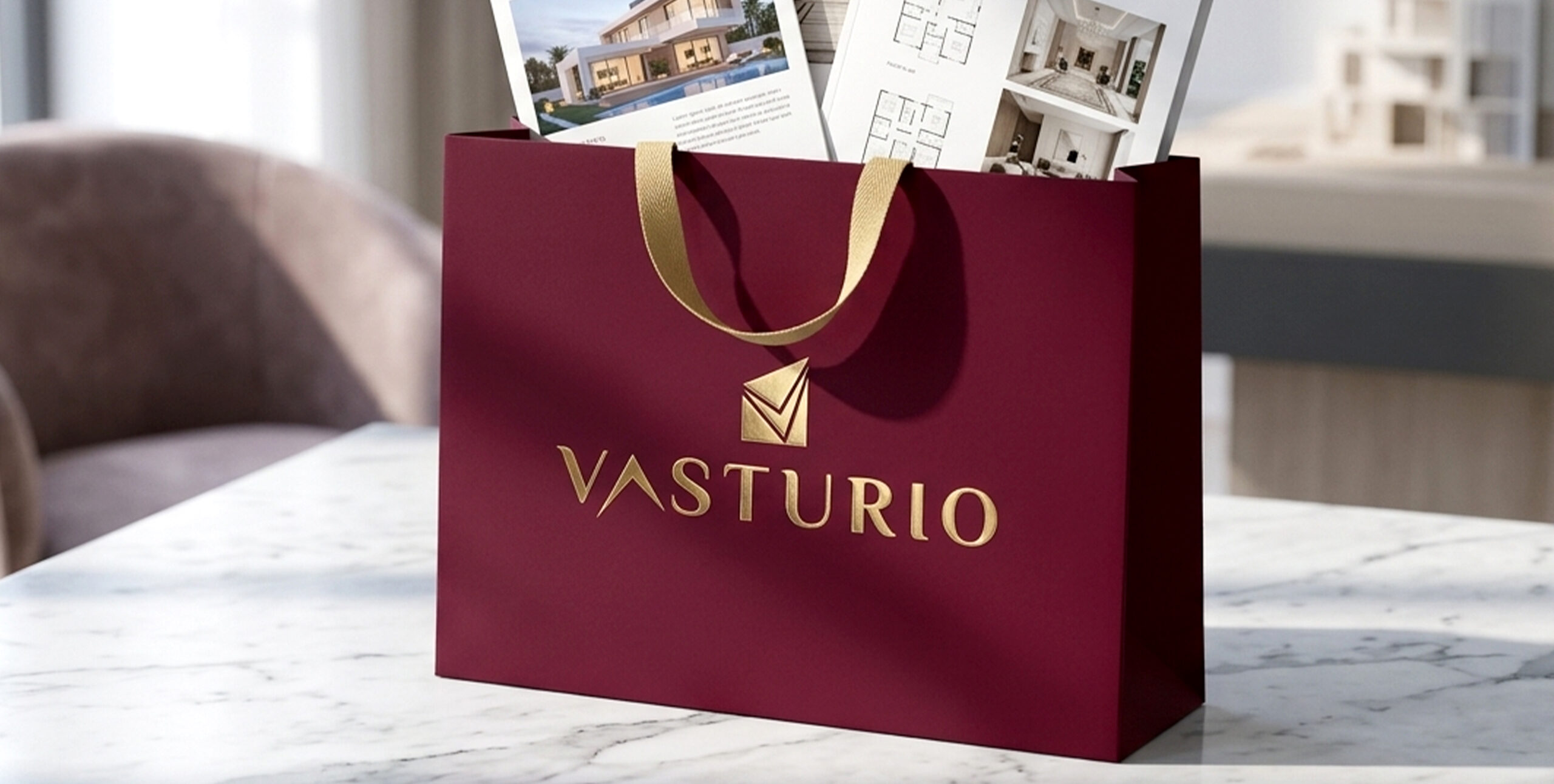
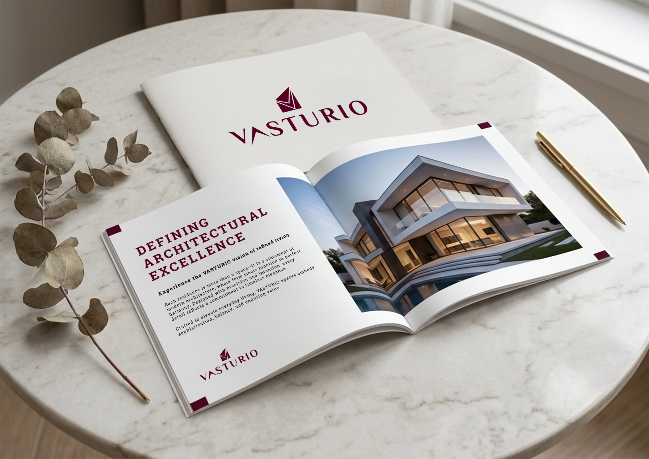
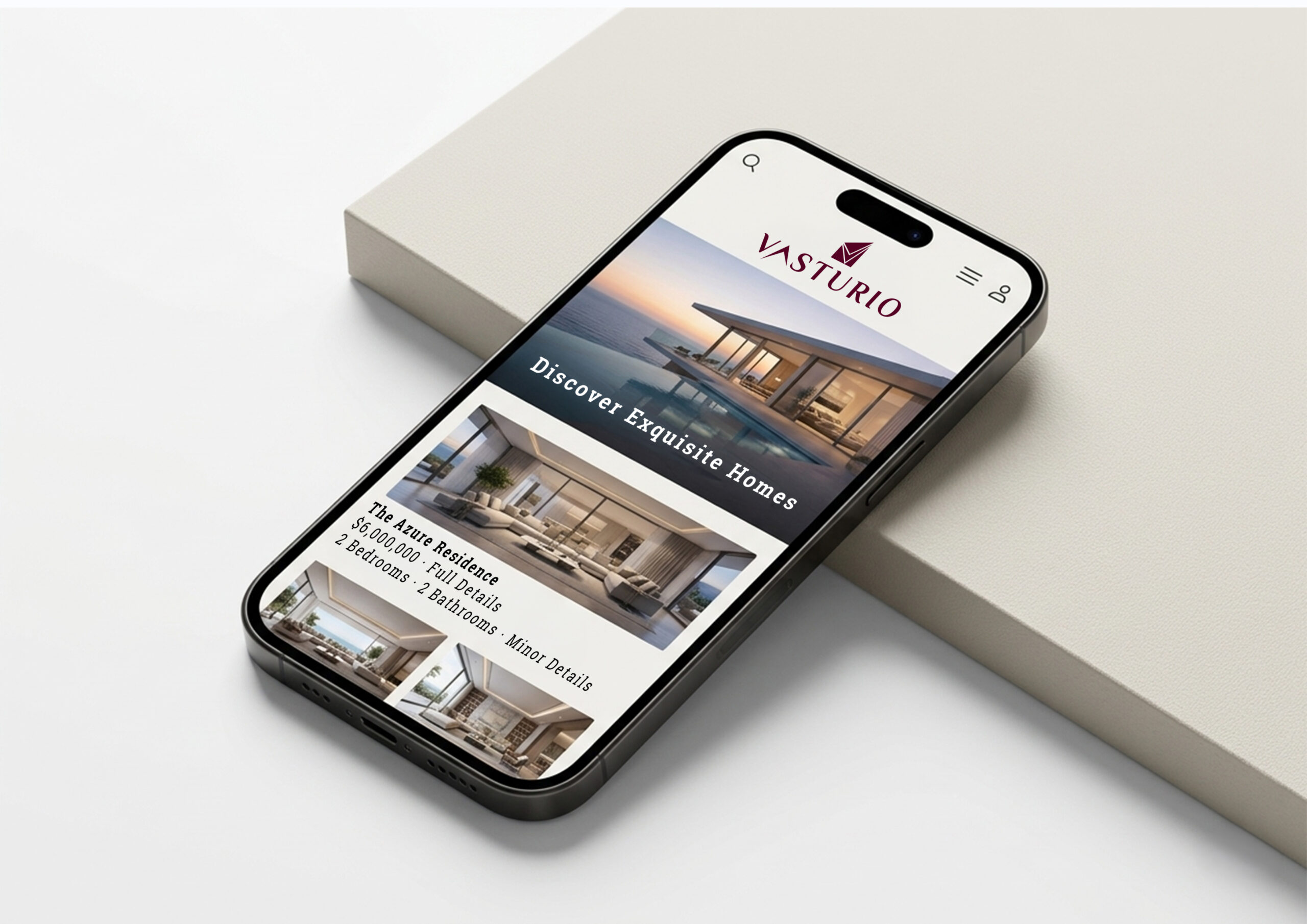
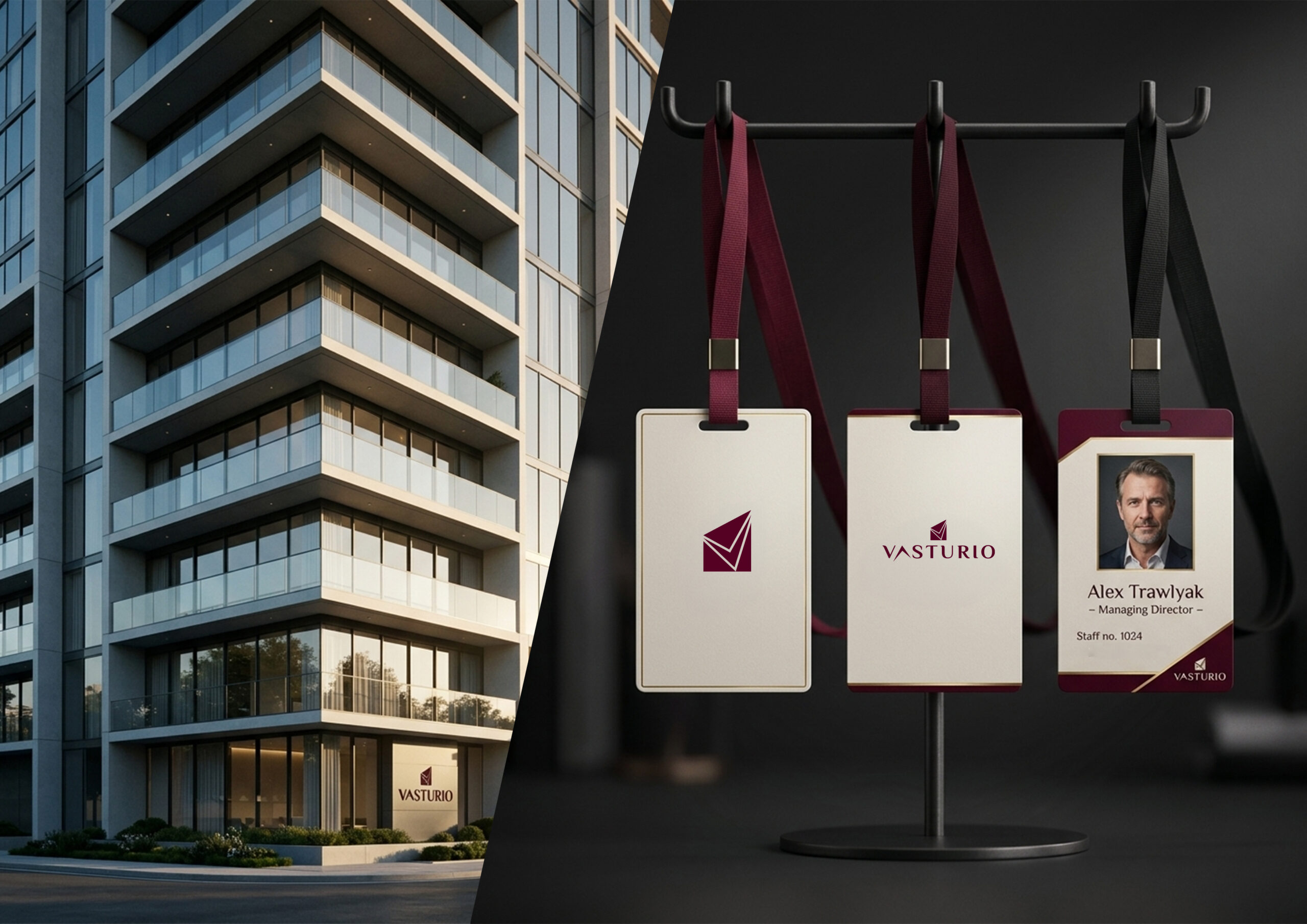
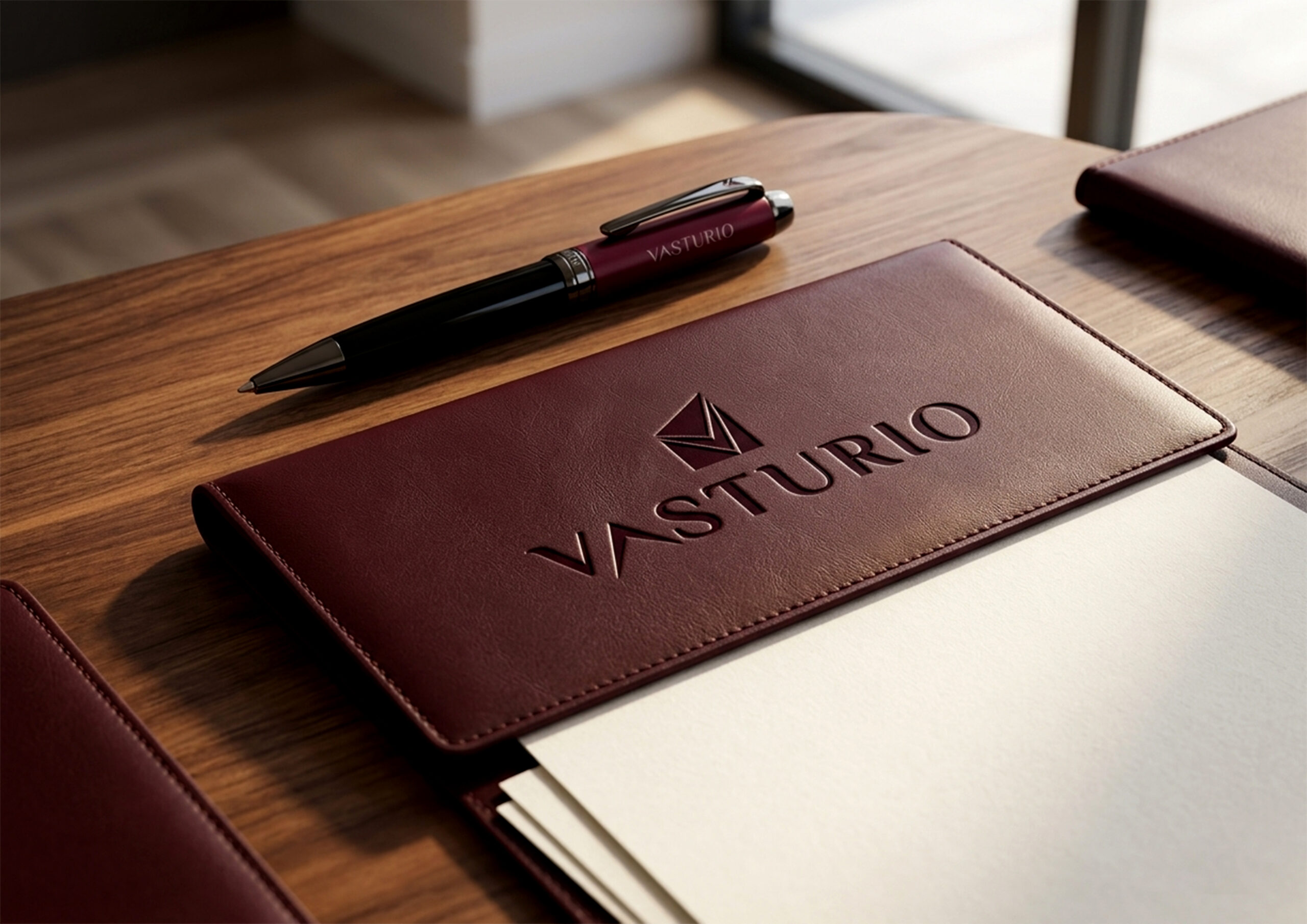
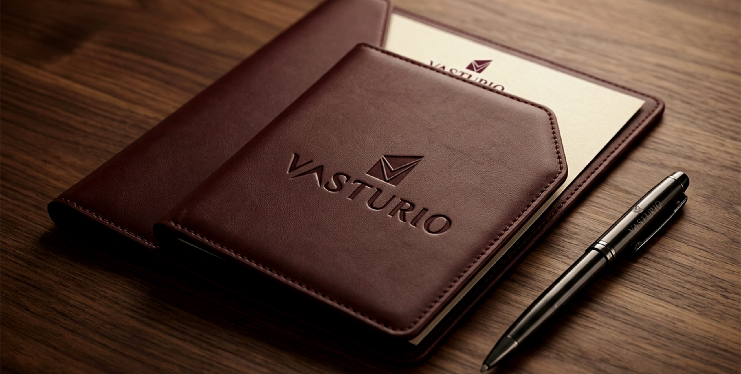
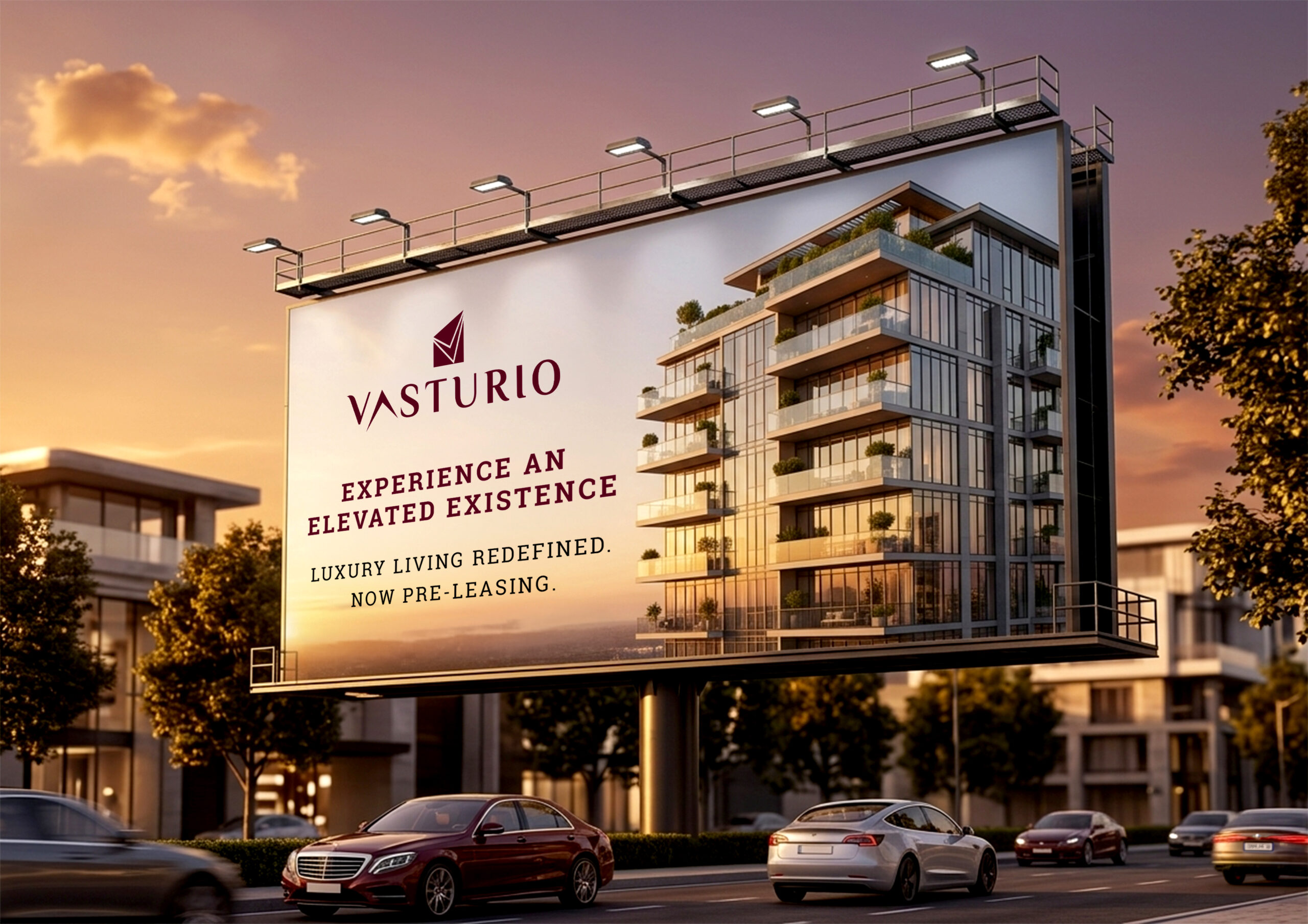
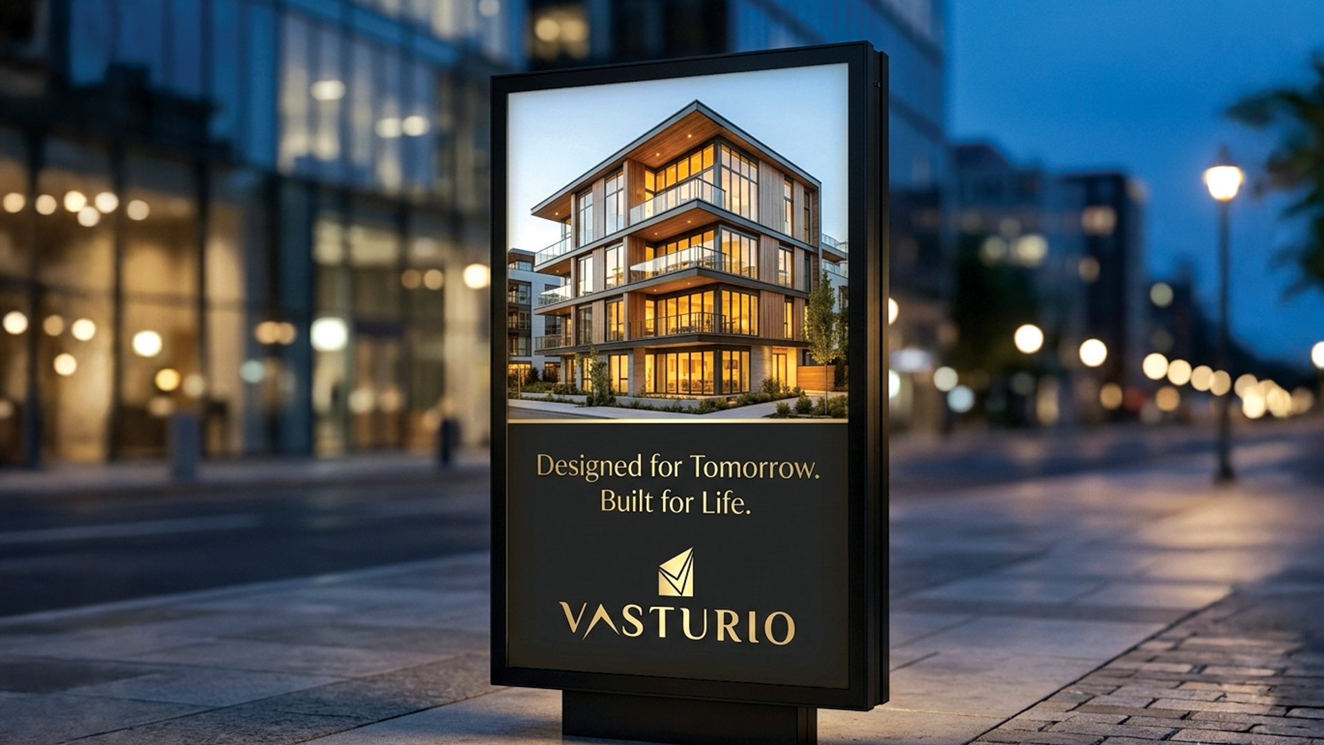
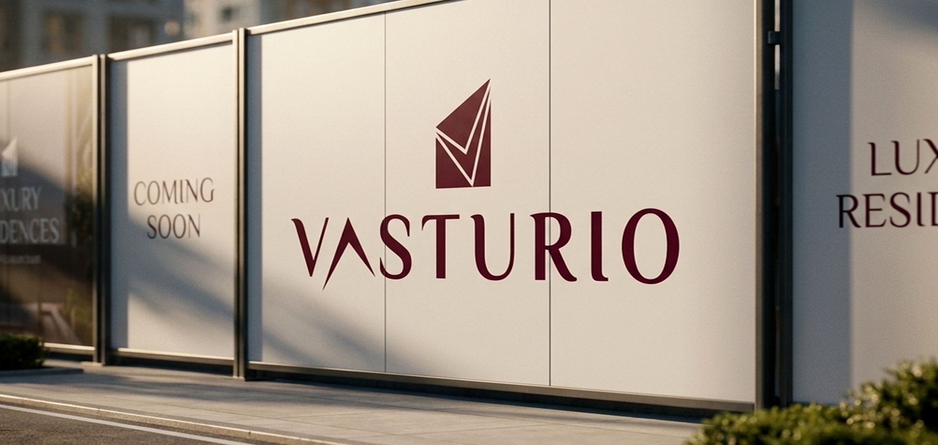
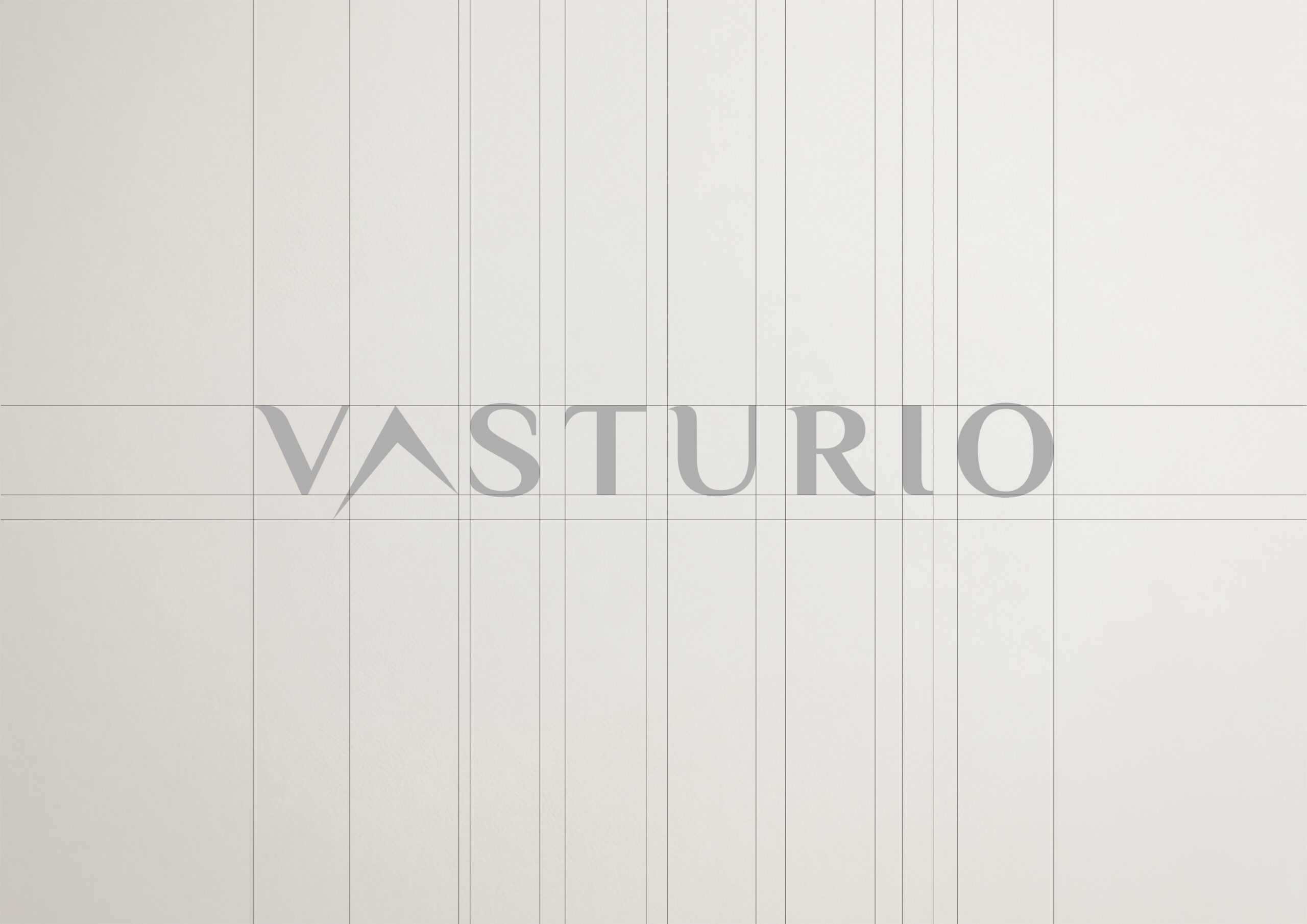
The identity extends seamlessly across multiple applications, maintaining consistency while adapting to different formats. From stationery to digital interfaces, the system preserves its visual integrity and reinforces a premium presence.Each application is designed to feel intentional, ensuring that the brand remains cohesive across both physical and digital environments.